Policy interface parameters and interactive controller additions
Author: Inventors quantify - small dreams, Created: 2024-06-26 17:42:51, Updated: 2024-08-02 16:11:43[TOC]

Inventors of QT platforms are committed to providing simple, easy-to-use, powerful, and continuously iterative quantitative trading tools for product design and functionality. By upgrading the "strategy parameters" and "interaction controls", the design flexibility of the parameters and interactions in the strategy design is further increased. The capabilities of the policy parameters and interaction controls are enhanced, making some design needs easier to achieve.
Parameters of the policy interface
The types of strategy parameters in inventor quantification have not increased, but remain the five types of parameters that we are familiar with:
- Parameters of the numeric type
- String type parameters
- Boolean type parameters
- Parameters for type of drawer
- Parameters for encrypted string types
I'm sure you're asking me, what is the update, what is the addition, what is the optimization of the platform?
This upgrade adds the "component configuration" of the parameter binding control, simplifies the functions of "partition" and "parameter dependence" and integrates the two functions into the "component configuration". The default value of the parameter adds an option of "selective fill"/"mandatory fill" to determine if the policy has a run condition, if the parameter is set to "mandatory fill" but the parameter control does not have a specific parameter written in it when the policy is executed, at which point the policy will not run. We're going to test it in detail in the next section to understand the upgrades that have been made.
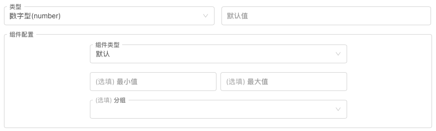
1, the numerical type parameter
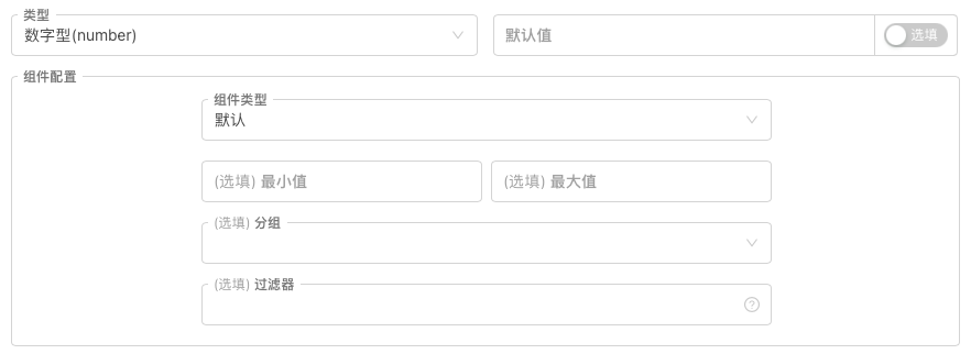
The following is the main explanation of the "component configuration", which can be understood as:
Set the parameters to the various properties, types, and rules of the constraint. The numeric type parameters (numeric constraints) are the default constraints for the input box, which can be set to limit the data received by the input box using the "minimum" and "maximum" controls in the graph.
In addition to the default input box controller, the platform has added:
- The time selector
In the "Component Type" option set to: time selector, the input box control on the policy interface corresponding to the current parameter will become a time selection control. When setting this parameter, select a specific time, the variable value of which is the time corresponding to the time parameter.
Such controls are commonly used for setting time ranges, start and end dates, so it is very convenient and intuitive to use a date control that lets the policy know the corresponding time stamp without the need to write complex time conversion code.
The variable value of the interface parameter is: numerical value (which represents the timestamp)
- The sliding input bar.
If the slider input control is set to slide, "minimum" or "maximum" must be specified to determine the range of the slider.
The sliding input bar can be very conveniently implemented as a parameter for controlling stop loss, stop failure, and of course there may be many other designs, which will not be discussed here.
The variable value of the interface parameter is: numeric (represents the location of the slider on the slider)
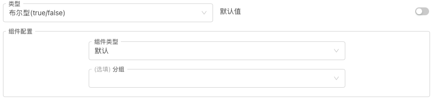
2, the Boolean type parameter
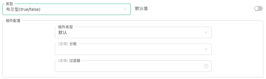
The Boolean type parameter is unique in that it has only one corresponding control; the default switch control; and the default parameter is optional.
Because the Boolean is a binary option, it is not true or false. It is therefore very suitable to use a switch control to correspond to this parameter type.
In general, the Bur type parameter on the platform is used to control whether certain policy functions are turned on.
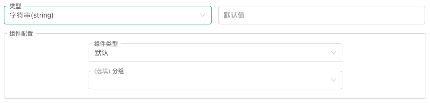
3, String type parameters
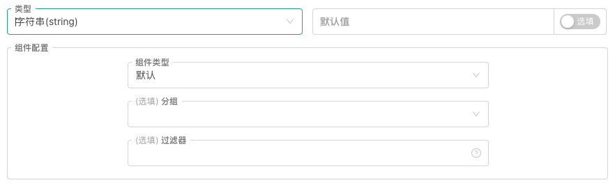
In addition to the default input box controller, the platform has added:
The text In the "Component Type" option, set to: Text. The input box control on the policy interface corresponding to the current parameter will become a larger text box. A text controller differs from an ordinary input box controller in that the text entered in the text box can be changed between lines, and the text box can be adjusted to the size of the control. The variable value of the interface parameter is: string.
Time selector In the "Component type" option, set to: Time selector. The input box control on the policy interface that corresponds to the current parameter will become the control that sets the time date. The "Time Selector for the Component Type of the String Type Parameter" differs from the "Time Selector for the Component Type of the Numerical Type Parameter" in that the Time Selector for the String Type Parameter has an additional "Time Format" option, which allows you to set the selection format of the control: 1, Date: "Time Format" is set to the date bar, the control is a full time selection control for years, months, days, hours, minutes and seconds, supporting one key to select the current time. 2 ̊ Time: When the "Time Format" is set to a time stamp, the control is a time-selection control for the time, time, or second. 3 ̊ Month: "Time format" is set to the month of the month of the year, the control is a time selection control for the year, month. 4 ̊ year: When the "Time Format" is set to
year , the control is a time selection control for the selected year. The variable value of the interface parameter is: string ((formatted as the corresponding time)). Color selector In "Component Type", select Set to: Color Selector. The input box control on the policy interface corresponding to the current parameter will become a color selection control. It is commonly used to design parameters to set colors. The variable value of the interface parameter is: string ((selected color corresponds to the color value, e.g.: #7e1717)).
4 Parameters of type of drop-down box
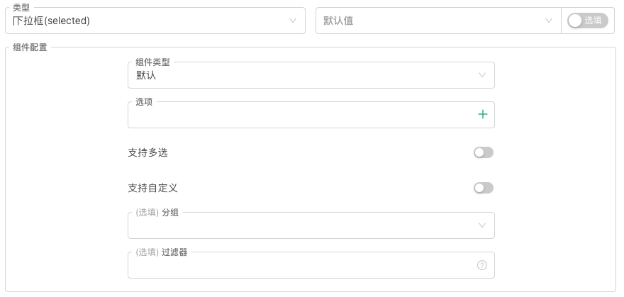
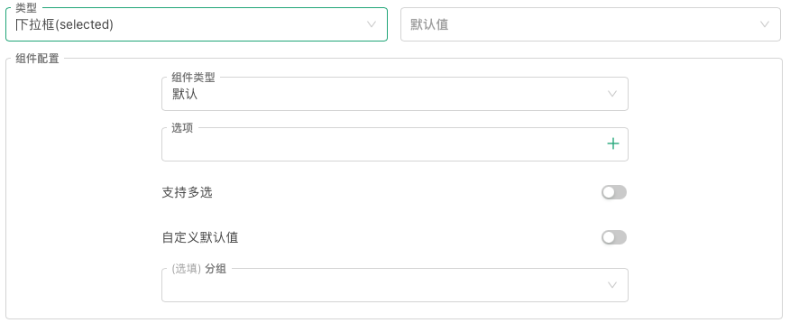
The default control for the type of drag box parameter is the drag box, but this is a lot of upgrades to the previously simple single-selection drag box:
- Support for multi-party elections Multiple options can be selected at the same time in the drop-down box control that corresponds to the drop-down box parameter, at which point the variable value of the drop-down box parameter is no longer the index of the selected option, but an array. The array contains an index or bound data of all the selected options.
- Supports customized default values Once this option is enabled, the default value can be set by default, without having to select an option from the drop-down box as the default value.
- Added the option to bind numbers, string functions, and drop-down box. Give the option a string or number bound, and when this parameter is set, the value of the drop-down box variable is no longer the selected option index, but the string or number bound by the selected option.
In addition to the default drag-and-drop control, the platform has added:
- Segmented controller In the "Component Type" section, select Set to: Segment Controller. This will turn the current parameter-bound control into a selectable segment slider that can select specific segment blocks. Generally, it can be designed to switch between several mutually exclusive options, filter content by category or label, choose between different modes of operation, etc. The variable value of the interface parameter is: index of the segment controller selected portion or selected portion of bound data ((bound data support numbers, strings)).
5, the encrypted string type parameter
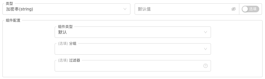
The encryption string type parameter is also special, as it has only one corresponding control; the default encryption input box control.
On platforms, encryption string type controls are generally used to set up some sensitive information, such as secret keys, passwords, etc. The input parameters are transmitted after encryption locally.
The variable value of the interface parameter is: string.
For all of the above types of policy interface parameters, this upgrade integrates the previous "parameter clustering" and "parameter dependency" functionality into the "component configuration". All of the interface parameters have "clustering" and "filter" settings in the component configuration.
- Clustered You can directly enter the label that you want to group in the control under the grouping drawer, and use the return key to determine the grouping input. The system records the current input label record to the grouping options. You can then assign a grouping to the current interface parameter. In the policy retrieval/true disk interface, parameters marked as a group are displayed in a grouped area after partitioning.
- Filters
In the filter control, some expressions are entered to determine whether the current parameter needs to be activated. This function enables the current parameter to be displayed or hidden depending on the parameter setting.
Examples of filter expressions:
where a, b are all variables of the policy interface parameters.过滤器格式: a>b , a==1 , a , !a , a>=1&&a<=10 , a>b
Testing policy for interface parameters
If the above explanation feels a bit counterintuitive, then the best way to understand it is to use it in practice and test these parametric functions:
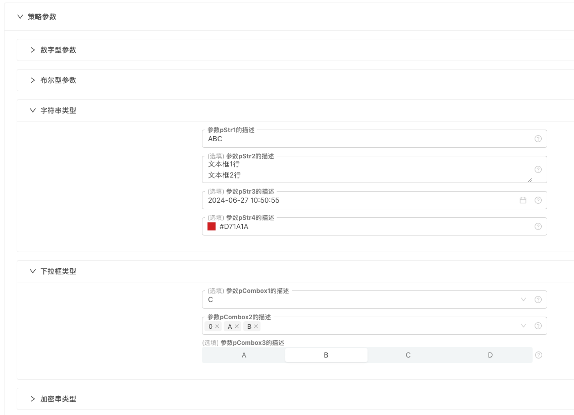
The following is an example of a JavaScript language policy:
function main() {
    Log("---------------------------开始测试数字类型参数---------------------------")
    Log("变量pNum1:", pNum1, ", 变量值类型:", typeof(pNum1))
    Log("变量pNum2:", pNum2, ", 变量值类型:", typeof(pNum2))
    Log("变量pNum3:", pNum3, ", 变量值类型:", typeof(pNum3))
    Log("变量pNum4:", pNum4, ", 变量值类型:", typeof(pNum4))

    Log("---------------------------开始测试布尔类型参数---------------------------")
    Log("变量pBool1:", pBool1, ", 变量值类型:", typeof(pBool1))
    Log("变量pBool2:", pBool2, ", 变量值类型:", typeof(pBool2))

    Log("---------------------------开始测试字符串类型参数---------------------------")
    Log("变量pStr1:", pStr1, ", 变量值类型:", typeof(pStr1))
    Log("变量pStr2:", pStr2, ", 变量值类型:", typeof(pStr2))
    Log("变量pStr3:", pStr3, ", 变量值类型:", typeof(pStr3))
    Log("变量pStr4:", pStr4, ", 变量值类型:", typeof(pStr4))

    Log("---------------------------开始测试下拉框类型参数---------------------------")
    Log("变量pCombox1:", pCombox1, ", 变量值类型:", typeof(pCombox1))
    Log("变量pCombox2:", pCombox2, ", 变量值类型:", typeof(pCombox2))
    Log("变量pCombox3:", pCombox3, ", 变量值类型:", typeof(pCombox3))

    Log("---------------------------开始测试加密串类型参数---------------------------")
    Log("变量pSecretStr1:", pSecretStr1, ", 变量值类型:", typeof(pSecretStr1))
}
The full parametric testing strategy:https://www.fmz.com/strategy/455212
The above parameters contain a parameter dependency design, and there are many policies that require a set of settings to be opened based on a parameter, which can be implemented with a similar parameter dependency.
Interactive controls
The inventors also have five strategic interaction controls for their quantitative trading platforms, which have also been optimized and upgraded; the addition of "component configuration" simplifies the grouping function.
1, numerical ((number)) interactive controller
The interactive controls are basically the same as the "component configuration" of the policy interface parameters, and the component types are supported in addition to the default input box controls:
- Time selector The interactive commands sent contain a timestamp of the selected time.
- Sliding input bar The sent interaction command contains a numerical representation of the selected slide position.
The usage is consistent with the various component types of the policy interface parameters, which will not be discussed here.
2, Boolean (true/false) interactive controller
The interactive controls are basically the same as the "component configuration" of the policy interface parameters.
3, string (string) interactive controller
In addition to the default input box control, component types support:
- The text The interaction commands that are sent contain what is entered in the text box.
- Time selector The interactive commands that are sent contain a time string for the selected time, and there are several formats to choose from.
- Color selector The sent interaction command contains a color value string for the selected color.
4, drop-down box ((selected)) interactive controller
The drop-down box for the interactive controls is also upgraded: "Support for multiple selections", "Custom Default", options for binding specific data, etc.
In addition to the default drag-and-drop component, the following features have been added:
- Segmented controller The interaction command sent contains the index or bound data of the selected slide.
5, buttons (button) interactive controls
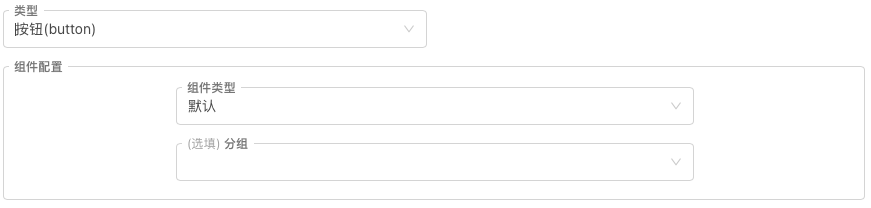
Button-type interactive controls do not have any input, and the interactive command sent when triggered contains only the name of the button control.
Testing strategies for interactive controllers
Manual testing is the best way to understand, and here is a test strategy.
Note that the interactive controller cannot be tested in the retest system, only a real-time test can be created.
function main() {
    var lastCmd = ""
    while (true) {
        var cmd = GetCommand()  // 接收交互控件产生的消息
        if (cmd) {
            Log(cmd)
            lastCmd = cmd
        }
        LogStatus(_D(), lastCmd)
        Sleep(500)
    }
}
Randomly enter some information, set some options, and then click on the interaction control button to generate an interactive message, which the policy captures and prints out.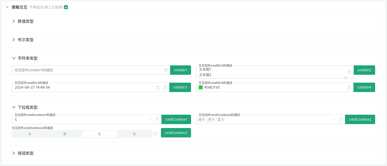
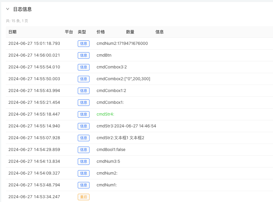
Completed interactive controller testing strategy:https://www.fmz.com/strategy/455231
Updated by
1, the platform updates the interface parameters and the type of strings for the interactive controls, the type of drop-down box; adds support for 2 new controls:
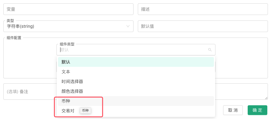
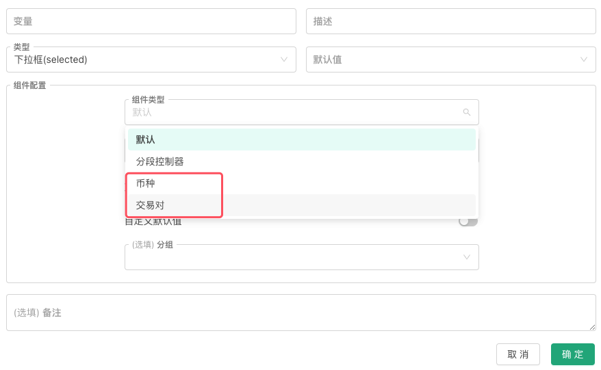
Set parametric testing of controls using currency controls, transaction codes (transaction pairs) in the policy interface parameters
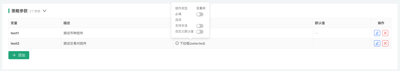
function main() {
    Log("参数test1使用币种控件选择后,test1的值为:", test1)
    Log("参数test2使用交易代码控件选择后,test2的值为:", test2)
}
- 1 currency
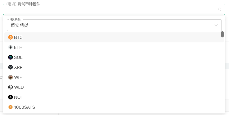
参数test1使用币种控件选择后,test1的值为: BTC
- 2, the transaction code (the transaction pair)
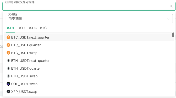
参数test2使用交易代码控件选择后,test2的值为: ETH_USDT.next_quarter
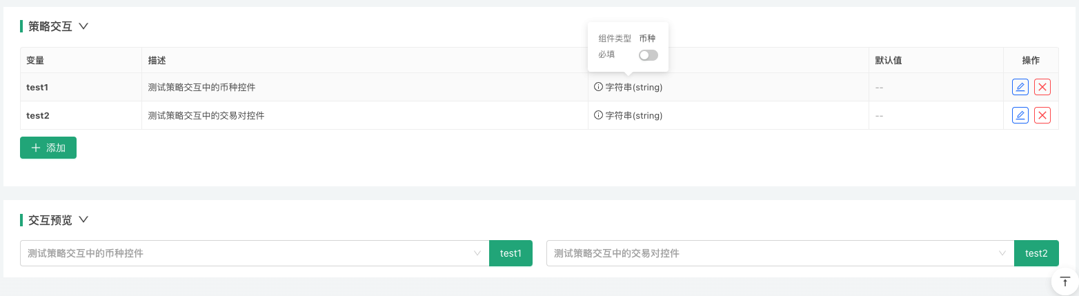
3, Set up interaction testing of controls using currency controls, transaction codes (transaction pairs) in strategy interaction controls:
function main() {
    while (true) {
        var cmd = GetCommand()
        if (cmd) {
            Log(cmd)
        }
        Sleep(2000)
    }
}
- 1 currency
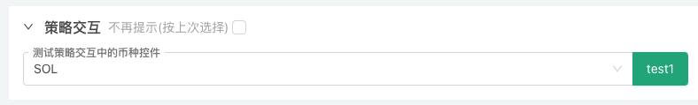
test1:SOL
- 2, the transaction code (the transaction pair)
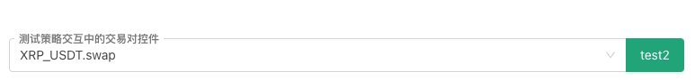
test2:XRP_USDT.swap
- Explore FMZ: the newest application of the status button
- Introduction to the Source Code of Digital Currency Pair Trading Strategy and the Latest API of FMZ Platform
- Digital currency pairing trading strategy source code and the latest API of FMZ platform
- Detailed Explanation of Digital Currency Pair Trading Strategy
- FMZ Quant & OKX: How Do Ordinary People Master Quantitative Trading? The Answers Are All Here!
- The digital currency pairing trading strategy is detailed
- Detailed Explanation of FMZ Quant API Upgrade: Improving the Strategy Design Experience
- Detailed Explanation of New Features of Strategy Interface Parameters and Interactive Controls
- FMZ Quantify & OKX: How can ordinary people play Quantify?
- Inventors quantify trading platform API upgrades: enhancing the strategic design experience
- Quantifying Fundamental Analysis in the Cryptocurrency Market: Let Data Speak for Itself!
- Quantified research on the basics of coin circles - stop believing in all kinds of crazy professors, data is objective!
- An Essential Tool in the Field of Quantitative Trading - FMZ Quant Data Exploration Module
- The inventor of the Quantitative Data Exploration Module, an essential tool in the field of quantitative trading.
- Mastering Everything - Introduction to FMZ New Version of Trading Terminal (with TRB Arbitrage Source Code)
- Get all the details about the new FMZ trading terminal (with the TRB suite source code)
- FMZ Quant: An Analysis of Common Requirements Design Examples in the Cryptocurrency Market (II)
- How to Exploit Brainless Selling Bots with a High-Frequency Strategy in 80 Lines of Code
- FMZ quantification: common demands on the cryptocurrency market design example analysis (II)
- How to exploit brainless robots for sale with high-frequency strategies of 80 lines of code