एफएमजेड का अन्वेषण करनाः स्टेटस बार बटन का नया अनुप्रयोग (भाग 1)
लेखक:FMZ~Lydia, बनाया गयाः 2024-07-26 16:45:02, अद्यतनः 2024-07-29 14:54:42
एफएमजेड क्वांट ट्रेडिंग प्लेटफॉर्म एपीआई इंटरफ़ेस के एक प्रमुख अपडेट के साथ, प्लेटफॉर्म के रणनीति इंटरफ़ेस मापदंडों, इंटरैक्टिव नियंत्रण और अन्य कार्यों को समायोजित किया गया है, और कई नए कार्य जोड़े गए हैं। पिछले लेख में इंटरफ़ेस मापदंडों और इंटरैक्टिव नियंत्रणों की अद्यतन सामग्री का विस्तार से परिचय दिया गया था। यह लेख एफएमजेड.कॉम के नए पेश किए गए स्टेटस बार बटन के आवेदन की खोज जारी रखता है।
हर रणनीति डेवलपर एक यूआई इंटरफ़ेस बनाने की उम्मीद करता है जो उपयोग में आसान, शक्तिशाली और डिजाइन में सरल हो। इस मानक को प्राप्त करने के लिए, एफएमजेड.कॉम प्लेटफॉर्म कार्यों को अपग्रेड करने और उपयोगकर्ता अनुभव में सुधार करने के लिए कोई प्रयास नहीं करता है। रणनीति पृष्ठ के स्थिति पट्टी में सीधे इंटरैक्टिव नियंत्रणों को डिजाइन करना इस मांग के आधार पर एक उन्नयन है।
इसके बाद, आइए एक बहु-विविधता रणनीति परिदृश्य में इसके अनुप्रयोग को देखें।
बहु-विविधता रणनीति परिदृश्य
चाहे वह पूरी तरह से स्वचालित मल्टी-वेरिएंट आर्बिट्रेज रणनीति हो या अर्ध-मनुअल मल्टी-वेरिएंट टाइमिंग रणनीति, रणनीति यूआई इंटरफ़ेस पर कुछ कार्यात्मक इंटरैक्टिव बटन होंगे, जैसे कि लाभ लेना, स्टॉप लॉस, पूर्ण परिसमापन, नियोजित सौंपना, आदि एक निश्चित उत्पाद के लिए।
तो चलो एक सरल उपयोग परिदृश्य के साथ स्थिति पट्टी बटन की नई सुविधाओं का पता लगाने. हमारी रणनीति कई किस्मों ट्रेडों मान लीजिएः
BTC_USDT स्थायी अनुबंध, ETH_USDT स्थायी अनुबंध, LTC_USDT स्थायी अनुबंध, BNB_USDT स्थायी अनुबंध, SOL_USDT स्थायी अनुबंध
जबकि रणनीति स्वचालित ट्रेडिंग निष्पादित कर रही है, हम रणनीति इंटरफ़ेस के स्थिति पट्टी में प्रत्येक उत्पाद के लिए एक खुली स्थिति बटन डिजाइन करने की उम्मीद करते हैं। हालांकि, इस खुली स्थिति बटन के लिए विस्तृत सेटिंग्स की एक श्रृंखला की आवश्यकता होती है, जैसेः
- आदेश का प्रकारः सीमा आदेश/बाजार आदेश।
- आदेश की मात्रा: मात्रा।
- आदेश की कीमत: कीमत।
- ट्रेडिंग दिशाः खरीदें (लंबी), बेचें (लघु) ।
इस उन्नयन से पहले, स्थिति पट्टी बटन केवल एक बटन बातचीत संदेश को ट्रिगर करता था। जटिल संदेशों को सेट करने के लिए नियंत्रणों की एक श्रृंखला को बांधने का कोई तरीका नहीं था। बातचीत के लिए यह उन्नयन समस्या को हल करता है। आइए कोड डिजाइन पर एक नज़र डालें। कोड में जोड़ी गई विस्तृत टिप्पणियां इस तरह के फ़ंक्शन को बनाने के तरीके को समझना आसान बनाती हैं।
डिजाइन के उदाहरण:
// Set the types of operations BTC_USDT.swap is the type format defined by the FMZ platform, indicating the U-standard perpetual contract of BTC
var symbols = ["BTC_USDT.swap", "ETH_USDT.swap", "LTC_USDT.swap", "BNB_USDT.swap", "SOL_USDT.swap"]

// Construct a button based on a button template
function createBtn(tmp, group) {
    var btn = JSON.parse(JSON.stringify(tmp))
    _.each(group, function(eleByGroup) {
        btn["group"].unshift(eleByGroup)
    })

    return btn
}

function main() {
    LogReset(1)

    var arrManager = []
    _.each(symbols, function(symbol) {
        arrManager.push({
            "symbol": symbol,
        })
    })

    // Btn
    var tmpBtnOpen = {
        "type": "button",
        "cmd": "open",
        "name": "Open a position and place an order",
        "group": [{
            "type": "selected",
            "name": "tradeType",
            "label": "OrderType",
            "description": "Market order, limit order",
            "default": 0,
            "group": "Trading setup",
            "settings": {
                "options": ["Market order", "Limit order"],
                "required": true,
            }
        }, {
            "type": "selected",
            "name": "direction",
            "label": "Trading direction",
            "description": "Buy, sell",
            "default": "buy",
            "group": "Trading setup",
            "settings": {
                "render": "segment",
                "required": true,
                "options": [{"name": "buy", "value": "buy"}, {"name": "sell", "value": "sell"}],
            }
        }, {
            "type": "number",
            "name": "price",
            "label": "price",
            "description": "The price of the order",
            "group": "Trading setup",
            "filter": "tradeType==1",
            "settings": {
                "required": true,
            }
        }, {
            "type": "number",
            "name": "amount",
            "label": "Order quantity",
            "description": "Order quantity",
            "group": "Trading setup",
            "settings": {
                "required": true,
            }
        }],
    }

    while (true) {
        var tbl = {"type": "table", "title": "dashboard", "cols": ["symbol", "actionOpen"], "rows": []}
        _.each(arrManager, function(m) {
            var btnOpen = createBtn(tmpBtnOpen, [{"type": "string", "name": "symbol", "label": "trading instruments", "default": m["symbol"], "settings": {"required": true}}])
            tbl["rows"].push([m["symbol"], btnOpen])
        })

        var cmd = GetCommand()
        if (cmd) {
            Log("Receive interaction:", cmd)

            // Parsing interaction messages: open:{"symbol":"LTC_USDT.swap","tradeType":0,"direction":"buy","amount":111}
            // According to the first colon: the previous instruction determines which button template triggers the message
            var arrCmd = cmd.split(":", 2)
            if (arrCmd[0] == "open") {
                var msg = JSON.parse(cmd.slice(5))
                Log("Trading instruments:", msg["symbol"], ", Trading direction:", msg["direction"], ", Order type:", msg["tradeType"] == 0 ? "Market order" : "Limit order", msg["tradeType"] == 0 ? ", Order price: current market price" : ", Order price:" + msg["price"], ", Quantity of order:", msg["amount"])
            }
        }

        // Output status bar information
        LogStatus(_D(), "\n", "`" + JSON.stringify(tbl) + "`")
        Sleep(1000)
    }
}
चलिए पहले चल रहे प्रभाव पर एक नज़र डालते हैं, और फिर बटन नियंत्रण के डिजाइन को विस्तार से समझाते हैं। रणनीति कोड चित्र में दिखाए गए अनुसार चलता हैः
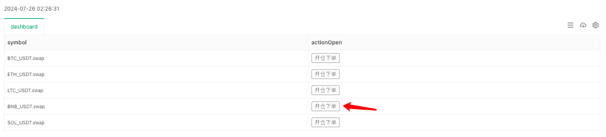
एक बटन पर क्लिक करें और एक पॉप-अप विंडो विशिष्ट आदेश जानकारी को कॉन्फ़िगर करने के लिए दिखाई देगाः
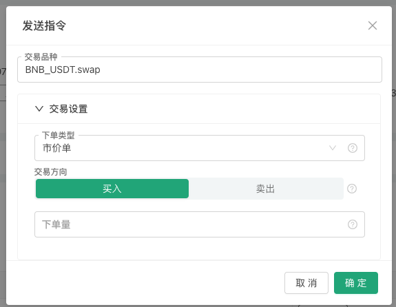
हम डिजाइन खोलने की स्थिति की जानकारी भरने के बाद, हम देख सकते हैं कि रणनीति लॉग कॉलम में संदेश प्राप्त किया है, और कोड में हम संदेश को पार्स और आदेश के विभिन्न सेटिंग्स आउटपुट. अगला, चलो इस बटन का निर्माण कैसे करते हैं पर एक नज़र डालते हैंः
सबसे पहले, हम एक बटन टेम्पलेट, जो एक JSON ऑब्जेक्ट है परिभाषित करते हैं, और इसे चर tmpBtnOpen को असाइन करते हैं। मैं नीचे कोड टिप्पणियों में सीधे विशिष्ट निर्देश लिखता हूं।
    {
        "type": "button",       // The type of status bar output control. Currently only buttons are supported.
        "cmd": "open",          // The message prefix received by the GetCommand function in the strategy when the button is triggered, such as this example: open:{"symbol":"LTC_USDT.swap","tradeType":0,"direction":"buy","amount":111}
        "name": "Open a position and place an order",      // Strategy interface, the content displayed on the button on the status bar, refer to the above picture
        "group": [{             // When the button is triggered, the controls in the pop-up box are configured and set. The group field value of this layer is an array, and the controls in the pop-up box are arranged from top to bottom according to the order of this array.
            "type": "selected",               // The first control type is: selected, drop-down box
            "name": "tradeType",              // When the status bar button is triggered, the message contains the settings of the control, and tradeType is the key name of the value currently entered in the drop-down box control. If the first option "Market Order" is selected, the message received by the GetCommand function contains the key-value pair information of "tradeType":0.
            "label": "orderType",               // When the button is triggered, the title of the current control in the pop-up box
            "description": "Market order, limit order",    // The description information of the current control will be displayed when the mouse is placed on the "small question mark" icon on the right side of the control.
            "default": 0,                     // The default value of the current control. For example, if the current control is a drop-down box, if no selection is made, the default value is the first option in the drop-down box. Usually, the default value of a drop-down box refers to the index of the drop-down box option, that is, the first one is 0, then 1, and so on. If the options of the drop-down box are in key-value format, the default value refers to value.
            "group": "Trading setup",               // If there are many controls in the pop-up box, they can be grouped. This field can set the grouping information.
            "settings": {                     // The specific settings of this drop-down box
                "options": ["Market order", "Limit order"],   // Options is a setting related to the drop-down box. It is used to set the options in the drop-down box. The value of this field is an array, which arranges the options in the drop-down box in sequence.
                "required": true,                // Required indicates whether it is set as mandatory (required) content.
            }
        }, {
            "type": "selected",         // This is also a Selected type
            "name": "direction",
            "label": "Trading direction",
            "description": "Buy, sell",
            "default": "buy",
            "group": "Trading setup",
            "settings": {
                "render": "segment",   // Unlike the default drop-down box control, the drop-down box can be replaced with a "segment selector" through the render field, such as the "buy/sell" control in the figure above.
                "required": true,
                "options": [{"name": "buy", "value": "buy"}, {"name": "sell", "value": "sell"}],   // Use key-value to set options
            }
        }, {
            "type": "number",           // Numeric input box type control
            "name": "price",
            "label": "price",
            "description": "The price of the order",
            "group": "Trading setup",
            "filter": "tradeType==1",   // The filter can be used to determine whether to display the current control. When tradeType==1, it means it is a market order, so there is no need to set the price for this control, so it is not displayed.
            "settings": {
                "required": true,       // Required when the control is activated (required)
            }
        }, {
            "type": "number",
            "name": "amount",
            "label": "Order quantity",
            "description": "Order quantity",
            "group": "Trading setup",
            "settings": {
                "required": true,
            }
        }],
    }
समूह चूंकि यह केवल एक उदाहरण है, इसलिए वास्तविक डिजाइन और उपयोग में अधिक आवश्यकताएं हो सकती हैं, जो एक स्थिति खोलने पर सेट ऑर्डर दिशा, मूल्य, मात्रा और ऑर्डर प्रकार तक सीमित नहीं हैं। लाभ लेने और स्टॉप-लॉस प्लान ऑर्डर जैसे निकास नियमों का डिज़ाइन भी हो सकता है। इसलिए, यूआई का नया संस्करण समूह क्षेत्र का समर्थन करता है, जो ऊपर स्क्रीनशॉट में
ट्रेडिंग सेटिंग्स की तह सेटिंग की तरह, प्रदर्शन के लिए पॉप-अप बॉक्स में नियंत्रणों के एक समूह को एक साथ समूहित करने के लिए सुविधाजनक है। आवश्यक बटन संरचना में समूह क्षेत्र में सेट नियंत्रण आवश्यक सेटिंग फ़ील्ड जोड़ता है यह निर्धारित करने के लिए कि यह आवश्यक है या नहीं। यदि यह आवश्यक पर सेट है लेकिन उपयोग के दौरान नहीं भरा गया है (चयनित) है, तो आप इंटरैक्टिव जानकारी भेजने के लिए ओके बटन पर क्लिक नहीं कर सकते हैं, और एक लाल संकेत संदेश प्रदर्शित होता है।
फ़िल्टर फ़िल्टर फ़ील्ड फ़िल्टर निर्भरता सेट करने के लिए जोड़ा जाता है. उदाहरण के लिए, उपरोक्त उदाहरण में, यदि बाजार आदेश प्रकार का चयन किया गया है, तो आदेश मूल्य आवश्यक नहीं है. आप नियंत्रण को
number और नाम price टाइप करके छिपा सकते हैं. प्रस्तुत करना इन बुनियादी प्रकार के नियंत्रणों के लिए (प्रकार क्षेत्र सेटिंग्स): संख्या, स्ट्रिंग, चयनित, बुलियन। सेट नियंत्रण रेंडर करने के लिए फ़ील्ड रेंडर जोड़ा गया, प्रत्येक नियंत्रण में अपने स्वयं के कई रेंडर घटक हैं। उदाहरण के लिए, उपरोक्त उदाहरण में, चयनित ड्रॉप-डाउन बॉक्स नियंत्रण को
सेगमेंट चयनकर्ता के रूप में रेंडर करना अधिक उपयुक्त है, क्योंकि ड्रॉप-डाउन बॉक्स को दो बार क्लिक करने की आवश्यकता है (पहली बार ड्रॉप-डाउन बॉक्स का विस्तार करने के लिए, दूसरी बार एक विकल्प का चयन करने के लिए) । सेगमेंट चयनकर्ता घटक का उपयोग करते हुए, आपको आवश्यक विकल्प का चयन करने के लिए केवल एक बार क्लिक करने की आवश्यकता है।
अंत में, सावधान पाठक पूछ सकते हैं, मैं पॉप-अप बॉक्स में नियंत्रण जानकारी नहीं देखता जहां आपने ऊपर स्क्रीनशॉट में
ट्रेडिंग प्रतीक लिखा था, और यह ट्रेडिंग प्रतीक ट्रेडिंग सेटअप समूह से संबंधित नहीं है (यानीः "group": "Trading setup"इस सेटिंग को लागू किया जाता है) ।यहाँ एक डिजाइन का एक प्रदर्शन है जो स्थिति पट्टी तालिका में बटन को स्थिति पट्टी में अन्य जानकारी से जोड़ता है।
createBtnकार्य टेम्पलेट के अनुसार अंतिम बटन संरचना का निर्माण करने के लिए प्रयोग किया जाता हैtmpBtnOpen, और अन्य जानकारी निर्माण के दौरान बटन संरचना में लिखा जाता है।// When constructing a button, bind the name of the current row and other information, add a control to the button's pop-up box, and place it first var btnOpen = createBtn(tmpBtnOpen, [{"type": "string", "name": "symbol", "label": "Trading symbols", "default": m["symbol"], "settings": {"required": true}}])तो अंतिम प्रभाव है कि जब आप लाइन के साथ बटन क्लिक करें
symbolकाBNB_USDT.swapरणनीति इंटरफेस के स्टेटस बार में, पॉप-अप बॉक्स मेंट्रेडिंग प्रतीक इनपुट बॉक्स को भर दिया जाएगा BNB_USDT.swapautomatically.
यह लेख UI के नए संस्करण के आवेदन का केवल एक छोटा सा हिस्सा प्रस्तुत करता है। इस तथ्य के मद्देनजर कि समग्र लंबाई, हम अगले लेख में अन्य मांग परिदृश्यों के डिजाइन पर चर्चा करना जारी रखेंगे।
आपके समर्थन के लिए धन्यवाद!
- एफएमजेड के लिए धनराशि प्राप्त करने और निगरानी के लिए रणनीति
- एक रणनीति टेम्पलेट आपको वेबसॉकेट मार्केट का उपयोग करने की अनुमति देता है
- एक नीति टेम्पलेट जो आपको वेबसॉकेट के क्षेत्र का उपयोग करने के लिए अनुमति देता है
- आविष्कारकों के लिए क्वांटिफाइड ट्रेडिंग प्लेटफॉर्म के लिए सामान्य प्रोटोकॉल एक्सेस गाइड
- एफएमजेड उन्नयन के बाद एक सार्वभौमिक बहु-मुद्रा व्यापार रणनीति कैसे बनाएं
- एफएमजेड के उन्नयन के बाद एक सार्वभौमिक बहु-मुद्रा व्यापार रणनीति बनाने के लिए तेजी से कैसे?
- डीसीए ट्रेडिंगः एक व्यापक रूप से प्रयुक्त मात्रात्मक रणनीति
- डीसीए लेनदेनः व्यापक रूप से सामान्य मात्रा रणनीति
- एफएमजेड का अन्वेषण: लाइव ट्रेडिंग रणनीतियों के बीच संचार प्रोटोकॉल का अभ्यास
- एफएमजेड का अन्वेषण करेंः लेनदेन की रणनीति और वास्तविक डिस्क के बीच संचार प्रोटोकॉल का अभ्यास
- FMZ: स्टेटस बटन का नया ऐप
- डिजिटल मुद्रा जोड़ी ट्रेडिंग रणनीति के स्रोत कोड और एफएमजेड प्लेटफॉर्म के नवीनतम एपीआई का परिचय
- एफएमजेड प्लेटफॉर्म के लिए नवीनतम एपीआई का परिचय
- डिजिटल मुद्रा जोड़ी व्यापार रणनीति का विस्तृत स्पष्टीकरण
- FMZ Quant & OKX: आम लोग मात्रात्मक व्यापार में कैसे महारत हासिल करते हैं? सभी उत्तर यहाँ हैं!
- डिजिटल मुद्राओं के लिए व्यापार रणनीति
- एफएमजेड क्वांट एपीआई उन्नयन का विस्तृत विवरणः रणनीति डिजाइन अनुभव में सुधार
- रणनीति इंटरफेस पैरामीटर और इंटरैक्टिव नियंत्रणों की नई विशेषताओं का विस्तृत स्पष्टीकरण
- FMZ क्वांटिफाइड & OKX: आम लोग क्वांटिफाइड ट्रेडिंग कैसे खेलते हैं? जवाब यहां हैं!
- आविष्कारकों द्वारा क्वांटिफाइड ट्रेडिंग प्लेटफॉर्म एपीआई उन्नयनः रणनीतिक डिजाइन अनुभव को बढ़ाना